



Maximize Your Outdoor Advertising Design with the 50:40:10 Rule
Designing effective out-of-home advertising isn’t just about making something big—it’s about making something instantly engaging, understandable, and memorable – a tall order but achievable if approached correctly.
Start with ruthless simplicity. A strong outdoor ad typically communicates one idea, not several. Think of iconic campaigns like those from Nike or Apple—they rely on minimal text and a single, striking visual. If someone can’t grasp your message in 3–5 seconds, it’s too complicated.
Clarity matters more than cleverness. Use large, legible fonts and high contrast between text and background. Avoid long sentences; a short headline (5–7 words max) paired with a bold image works best. Your viewers shouldn’t have to figure it out.
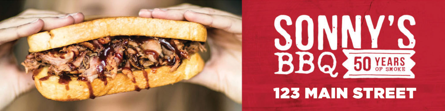
Visual hierarchy is your backbone. Guide the eye:
First, the image – Using a large “hero” beauty shot can be extremely effective in outdoor advertising. The image has to carry the message almost by itself because the visual should do the heavy lifting in communicating your end benefit to the viewer. Scale and composition matter more than usual. Your subject should dominate the frame—often 50% of the space. The image should be accompanied by a simple, straightforward headline. The message should be understood at a glance.
Second, your call to action should tell the viewer what to do – call, visit, scan, go to your website. Make it easy for them to know how to contact you.
Third, minimal text information is an important principle in out-of-home advertising. Short messages are easier to process and retain. This medium is designed for instant consumption, not reading.
And last, but most important, branding should be subtle but unmistakable. Your logo or brand colors should be present, but not overpower the message. The goal is recognition, not clutter.
These principals are for both print and digital ad design. Your ad should maximize viewer engagement, so make it simple and memorable. Humor, surprise, or a bold visual twist can make people remember your ad long after they’ve passed it. But don’t sacrifice clarity for creativity—if the joke takes too long to land, it fails.